Nolla
innovative zero-waste fine dining
Client:
Nolla
Year:
2026
Type:
Digital
,
Identity


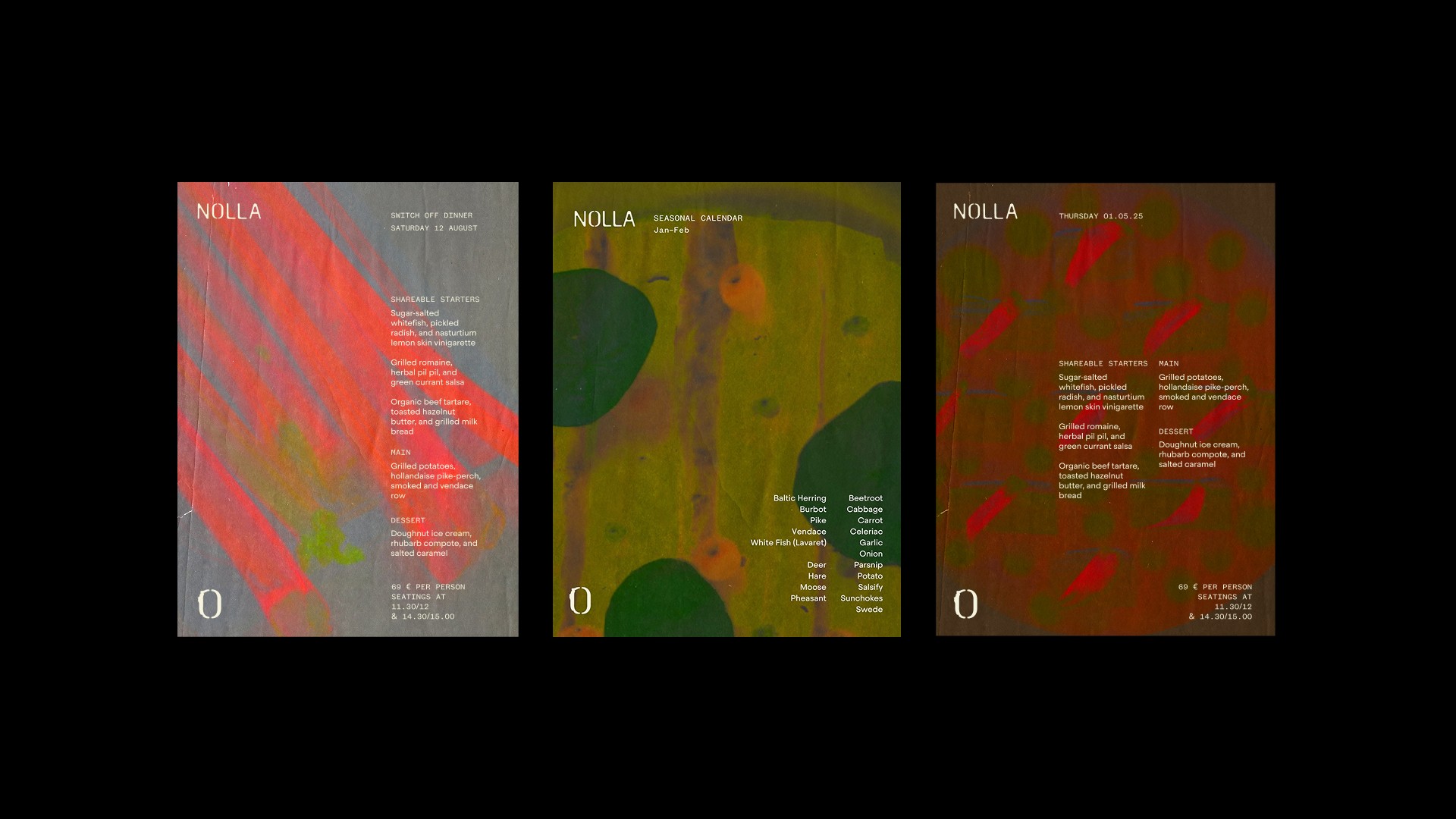
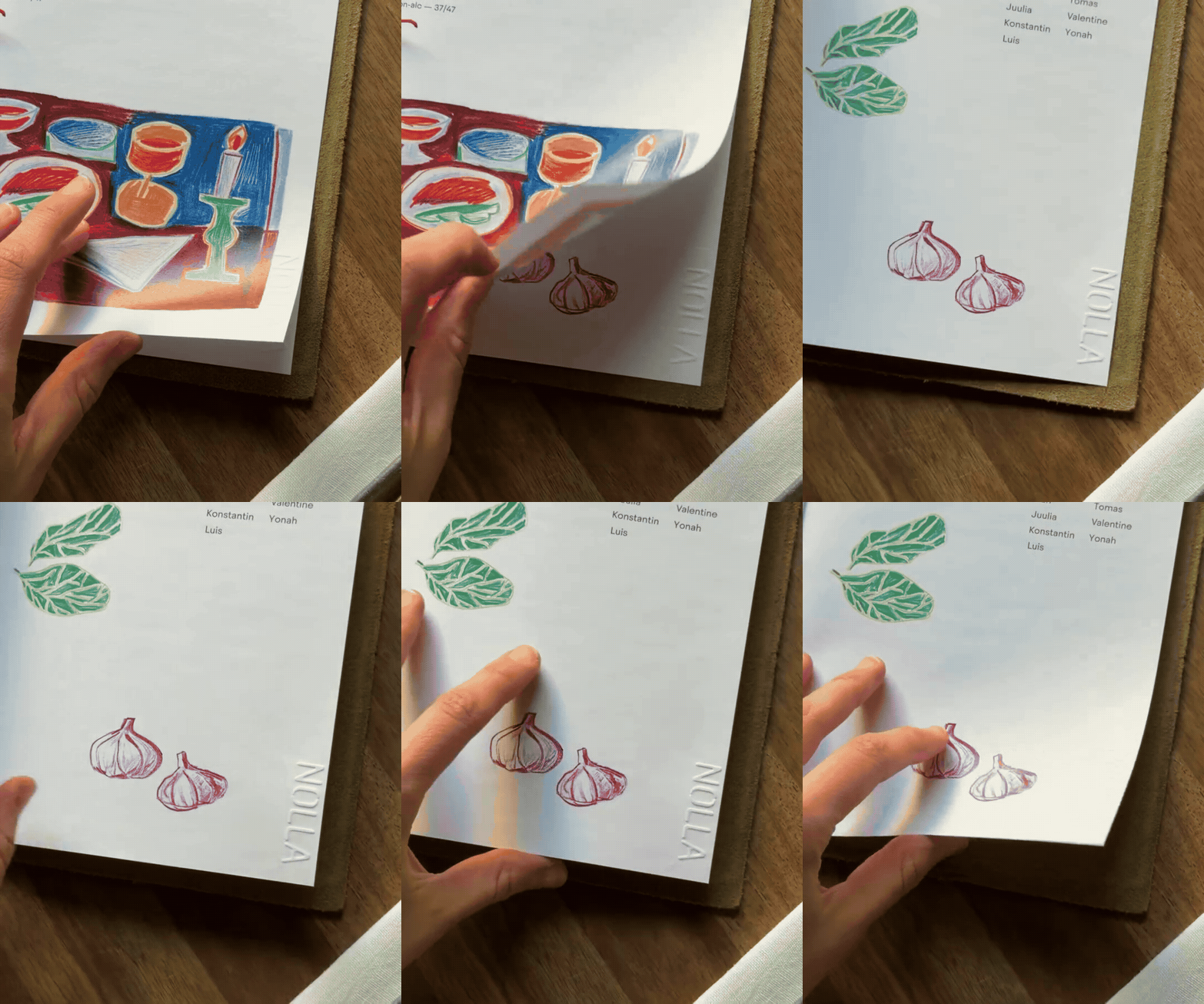
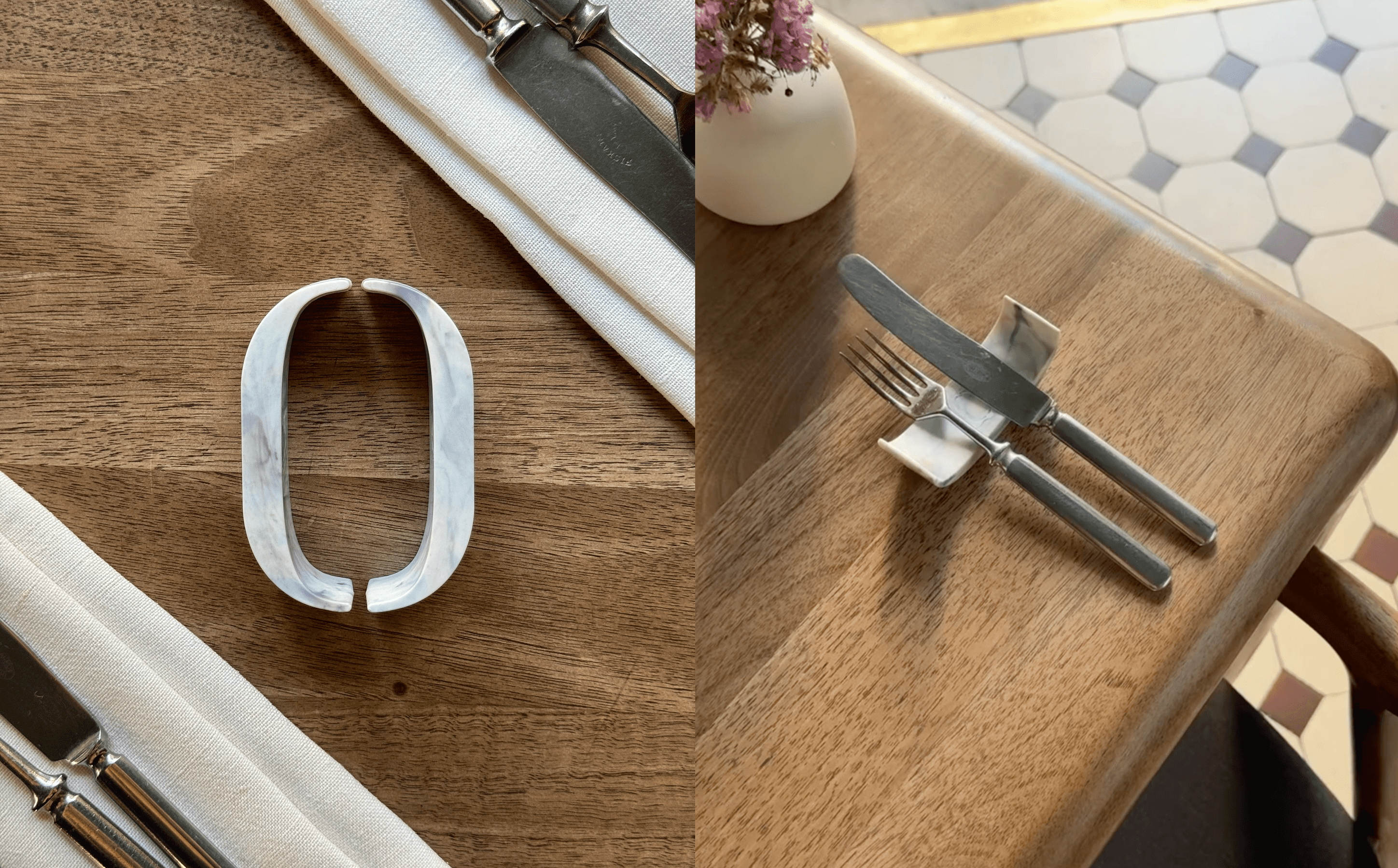
The logo is a custom streamlined and soft-edged marque that’s embossed into the menu paper and features a delicate ‘0’ (Nolla means zero in Finnish). The construction designed to be minimal and beautiful- just like the culinary creations.

Project Description
Nolla means zero in Finnish — and for this Helsinki-based restaurant, it's a philosophy. The team are redefining dining through a fully circular, zero-waste model, changing the face of the food industry from the inside out.
The brief: minimal physical footprint, maximum visual and storytelling impact. The identity centres on a custom logotype — streamlined, soft-edged, with a delicate '0' at its heart nodding to both name and ethos. Embossed directly into menu paper, it carries the same restraint and intention found in the culinary creations themselves.
Accompanying textures are drawn from the restaurant's own dishes and ingredients — organic, tactile, and specific to Nolla rather than reaching for generic visual language.
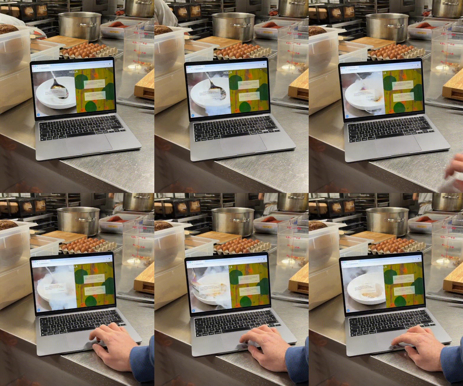
The website, built in close collaboration with a developer, carries the same spirit into the digital space: experimental, crafted, and built to tell a story. A year in the making, and one of the most rewarding projects to date.
Credits
Design
: Hen Pritchard-Barrett